08 May 2009


Miscela Sign

This is a first draft of the sign for Miscela. I'm unsure of the "frame" of the sign...as well as if the layout works or not.
01 May 2009
Two Images of better quality to use for System App
.jpg)
.jpg)
Alright, so these are the two images I could find that are of better quality. I still might try to get over to Saffron to try to shoot photos...but it's pretty high end... Think I need more to show the interior off more? What sold me on the interior of Saffron is the entrance host booth...it's curved like a lot of my identity! The only thing missing is a stage for performances and art on the walls...
New Signs for Miscela (unedited)


This is a new sign that I think would be appropriate for Miscela. It still needs editing. The wordmark for Miscela would be applied vertically as it is seen in the rest of the identity. Also, the color of the paint on the windows of the exterior of the building would be edited to fit within the identity of Miscela. Let me know what you think...the interior and exterior of the restaurant are the two pieces that I am struggling to find peace with...!
29 April 2009
Second Phase Drink/Appetizer Menu...


This menu will be printed on smooth cream colored paper as it will be printed weekly at the restaurant. I'm still unsure about the layout, so if anyone has any suggestions I would love to hear them. Also, I'm still working on finding a new exterior to use for Miscela as well as interiors. I'm not sure of anywhere at this moment...although, these images from Saffron's website are inspirational and it's in Minneapolis...
28 April 2009
Initial Interior/Signage for Miscela & Drink Menu


 This is the direction in which my system application has gone...let me know what you think. The menu will be edited and will have a back side with appetizers. It's going to be what in Italy is known as an "Aperitivo" menu...although it won't be exactly as they do Aperitivo.
21 April 2009
Miscela Menu exterior


I'm having a bit of trouble with the layout of the menu. I was tortured by the printer during the creation of the Welcome booklet, so I am nervous about depending on the printer being my friend. I want to create a full menu. So far I have the exterior rough laid out. I found six images to add to the interior of the menu in a similar fashion as the Welcome booklet. Also, I've included the very rough start to my Graphic Standards Manual. Any initial thoughts are always welcome!
Inspirational Graphic Standards Manuals


It was much more difficult to find an inspirational graphic standards manual than I imagined it would be. Thus, I think out of the manuals I looked at, which was a great number of them, the graphic standards manual that Spunk created for the College of Design for the University of Minnesota is inspirational to me. Additionally, I think that the simpler the graphic standards manual the easier and more likely users will be to follow the guidelines in the manual.
11 April 2009
Miscela ID
Miscela's identity system emulates the shape of the snails shell as well as a meandering path, in an attempt to communicate the slow relaxed pace at Miscela. This is all done through die cuts (on the business card, the member card, the envelope, and the welcome booklet), as well as the pattern that will be applied to each piece of the communication system. The initial communication system consists of a welcome booklet for New Coop Members, which includes Miscela's story, What coop members mean to Miscela, a Miscela Member card, and a business card for Miscela. Additionally, the booklet will come in a envelope/package that emulates all of the design elements of the booklet. The communication application will be a menu for Miscela, in addition to the standards guide.
Images are yet to come.
Images are yet to come.
31 March 2009
Miscela Logo Crisis

 I am not sure what I am doing with my logo. I am having a hard time achieving the quality that I want. I am using india ink and then I bring it into illustrator. I want a hand drawn quality, but I also want it to be professional and clean. Clean and rugged at the same time.
Miscela Identity initial sketches/materials


I went to Anchor Paper on Friday and picked up a bunch of paper samples and browsed the aisles for over an hour! If you haven't been there, definitely check it out! The staff there are amazingly helpful too.
I have focused the target of my identity system to be NEW members of the Miscela Restaurant Coop. The identity system will include a business card to be distributed via mail/or in the restaurant. It will also include a letterhead with a member card attachment at the bottom that will be perforated (Anchor Paper has a perforator blade!) so that members can take their member card and put it in their wallet. Additionally, Miscela's identity will include a container to hold all of this information. Currently I am working on the structural framework. I found tags at Anchor Paper too that I thought would be a subtle detail to add to the container. The problem that I found at Anchor Paper with their paper is that if you want to get a 11"x17" sheet of paper, it will cost $10 for the first cut (and this only works if they have the "parent" paper in stock)! Does anyone have any other great sources for paper??
I'm unsure about ordering plates for the letter press, because I am not sure how to implement the production portion of the assignment. I think I would use the letter press for Miscela's entire identity. I'm not sure how big the plates would need to be.
I looked into getting a stamp made. For a stamp that is 4"x1" it would be $21 at Anchor Paper.
Anyway, I really want the identity of Miscela to wow you all. That is the goal.
23 March 2009
Uncertain
For now, Miscela's system identity consists of a letterhead, business card, menu, and an envelope. The purpose of the letterhead is to use it to send out letters to potential members of the coop, members of the coop, future artists, artists, future musicians, musicians, and farmers (for fresh produce), bakers (for fresh breads), and other potential vendors for other food items. I will post my sketches at a later time...
My ID Inspiration Source
I forgot to include where I found all of the identity systems that I have noted as my inspiration for the Miscela ID. All of them were drawn from the AIGA archives.
09 March 2009

08 March 2009
Miscela Identity Inspiration

I like this identity because it demonstrates creative use of color and graphics. Something similar to this would work for Miscela's identity because of all of the different activities that Miscela offers to the public.

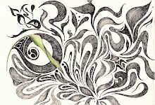
I like this for its simple application of color and type. The graphic is artistic and eye catching because of the way that each shape forms the greater shape of the monkey. I like this too because of the mosaic style, which I had envisioned for the Miscela logo during one of the stages of design.


Above is a compilation of identity systems that I found to be inspirational to the identity of Miscela. As I searched for identity systems that could inspire Miscela's identity I looked for systems that utilized color, abstract imagery, symbols, and/or patterns. The identity for Miscela needs to be playful, eclectic, artistic, and representative of the coop. Right now, imagery might play a role in Miscela's identity, but graphics will play more of an important role.
My initial thought on what I will need to create for Miscela's identity system consists of the following pieces: a menu, a website, napkins, pens, t-shirts, letterheads, envelopes, business cards, and magnets.
06 March 2009
Stage 3 Miscela Logo Design
I'm having a hard time figuring out how to make Version 1 of my logo design work...but I do like this solution better than Version #2. I agree with Ange that perhaps the wordmark is the primary logo, while the snail becomes the supporting element to the restaurant. Does anyone think that I need to include "restaurant coop" in the wordmark, perhaps below it, so that people know what it is? Otherwise, right now it is really ambiguous. I'd love to hear anyone's thoughts on this. Also, for a tagline here are a few options so far:
"Miscela, The right blend. Food. Music. Art."
"Slow Your Roll."
"Stay a While"
"Our Place is Your Place."
"Together We Can Make It Better."
"The Right Mix"
"Get To Know Us."


"Miscela, The right blend. Food. Music. Art."
"Slow Your Roll."
"Stay a While"
"Our Place is Your Place."
"Together We Can Make It Better."
"The Right Mix"
"Get To Know Us."


01 March 2009


Colors & Logo refinements


After trying to create my logo in illustrator and not getting any satisfaction out of it, I chose to go to india ink and a brush, as well as micron pen in order to come up with a word mark that I could work from in illustrator.
Also,
Luke referred me to kuler.adobe.com to get inspiration for color for Miscela's logo. So I have been trying to come up with a warm color palette, but also something that is unique for an Italian restaurant, as most Italian restaurants have a very warm, rustic ambience.
Subscribe to:
Posts (Atom)