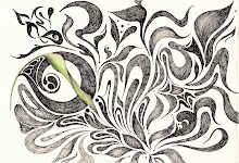


After trying to create my logo in illustrator and not getting any satisfaction out of it, I chose to go to india ink and a brush, as well as micron pen in order to come up with a word mark that I could work from in illustrator.
Also,
Luke referred me to kuler.adobe.com to get inspiration for color for Miscela's logo. So I have been trying to come up with a warm color palette, but also something that is unique for an Italian restaurant, as most Italian restaurants have a very warm, rustic ambience.

Good ideas, these roughs are coming together nicely and have a unique quality not easily designed digitally! Glad to hear that you explored other mediums to get a look you wanted.
ReplyDeleteGreat progress from your multiple rounds of roughs. The two concepts you presented today were thoughtful, unique, and memorable. Now, let's get them to that 'final' stage . . .
ReplyDeleteWhile it's nice that the wordmark does the talking in #1, the snail is a nice touch– it's just not the right style or quality. The snail symbol is much more on point in #2, but here it starts to take over the focus and perhaps draws too much attention. A balance needs to be found– and maybe you find that the snail does not need to be in the logo, but becomes a supportive element. However, remember that it's quality and style needs to be similar to the logo so that they look related.
See if you can get a bit more of the handdrawn quality of your india-ink rough into #1. There is a bit too much repetition and similarity and at a small scale, the readability could be reduced to almost nothing. Perhaps you build a progression of spacing into it, so it's not so evenly distributed. On the otherhand, the letterforms in #2 are unified and strong, but not very memorable . . . here the snail is doing all the talking. It really becomes a balancing act– it's up to you to do the juggling! Color palette is strong. Perhaps color and orientation (strongly horizontal) becomes a huge portion of your identity (verses shapes or photographs). Also, consider supporting typefaces that will work with the logo you choose (I'm leaning more towards #1).