


Above is an image from the floor at the Vatican that is close to the quality that I would like my symbol to have when it is finished. The snail image is a possible symbol for Miscela, and the typographic study is by a designer, Tauba (I can't remember their first name) that I love for its organic qualities, great detail, and varied line quality.
I've been sketching more ideas for my logo, as I find it a lot easier to brainstorm on paper rather than on the computer. I'm trying to figure out the symbol for my wordmark. The wordmark is going to be the point of emphasis for Miscela's identity. I'm thinking that perhaps an image of a snail (see above image) might be appropriate, because the staff at Miscela want people to stay a while, enjoy the food, the atmosphere, and the people they are with and those around them. Additionally, the shell of a snail emulates that of blending and is an organic shape, which is what I am looking for. Otherwise, I might create an abstract symbol to represent Miscela. Any advice?
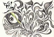
I think the above images are quite beautiful, the idea of the snail abstracts the concept of your restaurant and represents your company's focus. I like the concept of the red figure/black figure pottery aesthetic of a symbol from your first image, it hints at older, slower times when people would take some time to do things.
ReplyDeleteA snail is a great place to start for symbol inspiration– the shape itself is organic and its meaning relates to the mission of your restaurant. I'm excited to see your roughs!
ReplyDeleteI love the name for your company because it is unique, italian and memorable. I think the snail shape is perfect to start with in relation to what your name means as well as your restaurant. I'd love to see some sketches :)
ReplyDelete