23 February 2009

Slow Food Logo

Below is the Slow Food logo and word mark. I love the snail. They beat me to it...


perhaps a tortoise would be appropriate more so than a snail, as I don't want people to get Miscela confused with Slow Food International since there is a Slow Food Minnesota chapter.
 

Slow Food Movement

I was doing more research on my logo in class today and discovered that Slow Food International's logo is a yellow snail. If I can differentiate my logo and my word mark enough, I don't think this should be a problem, anyone have any thoughts on this? The Slow Food movement was inspiration for the foundation of Miscela, so it sort of works. 


Miscela Mission Statement

At Miscela we want everyone to enjoy themselves through the warm and inviting atmosphere, the quality food, the art, the conversation, and the music. Our mission is to create this environment for you to stay as long as we are open. 

Today, people are in such a hurry to get in and get out. Why not stay a while and enjoy the people you are with, enjoy the food you are eating, savor the drink you are sipping, listen to great music, and view beautiful art. 

22 February 2009

More inspirational images for Logo


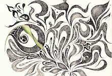
Above is an image from the floor at the Vatican that is close to the quality that I would like my symbol to have when it is finished. The snail image is a possible symbol for Miscela, and the typographic study is by a designer, Tauba (I can't remember their first name) that I love for its organic qualities, great detail, and varied line quality.

I've been sketching more ideas for my logo, as I find it a lot easier to brainstorm on paper rather than on the computer. I'm trying to figure out the symbol for my wordmark. The wordmark is going to be the point of emphasis for Miscela's identity. I'm thinking that perhaps an image of a snail (see above image) might be appropriate, because the staff at Miscela want people to stay a while, enjoy the food, the atmosphere, and the people they are with and those around them. Additionally, the shell of a snail emulates that of blending and is an organic shape, which is what I am looking for. Otherwise, I might create an abstract symbol to represent Miscela. Any advice?


18 February 2009

New Company Name


I have come up with a new name for my company. It is Miscela, it is Italian for "blend." It is easy enough for people to pronounce and addresses the foundation of my restaurant co-op, which is a bunch of activities and people coming together for their love of food, art, music, and culture. 

The images above are inspirational for the identity of the restaurant atmosphere as well as the identity. Art Nouveau and Italian Renaissance will influence the look and feel of the identity. 


15 February 2009

Restaurant Co-op

The idea of a restaurant co-op is brilliant. From my understanding it can be a mix of people investing in the restaurant's success. However, the restaurant co-ops I have read about are all employee owned, so I am not sure if there are any that allow for other members to contribute and benefit from their membership in the co-op. I think co-ops are going to become more and more popular in the U.S. as time goes on, because they are a great way to start a business and get people involved who share the common interest of the company. Also, people who get involved in the co-op generally support the founding ideas of the co-op and value the success of the co-op.

The restaurant co-op that gave me the idea to create a restaurant co-op for this project can be found at the following page:

http://jscms.jrn.columbia.edu/cns/2005-11-29/mascia-co-oprestaurants