I like this identity because it demonstrates creative use of color and graphics. Something similar to this would work for Miscela's identity because of all of the different activities that Miscela offers to the public.

I like this for its simple application of color and type. The graphic is artistic and eye catching because of the way that each shape forms the greater shape of the monkey. I like this too because of the mosaic style, which I had envisioned for the Miscela logo during one of the stages of design.


Above is a compilation of identity systems that I found to be inspirational to the identity of Miscela. As I searched for identity systems that could inspire Miscela's identity I looked for systems that utilized color, abstract imagery, symbols, and/or patterns. The identity for Miscela needs to be playful, eclectic, artistic, and representative of the coop. Right now, imagery might play a role in Miscela's identity, but graphics will play more of an important role.
My initial thought on what I will need to create for Miscela's identity system consists of the following pieces: a menu, a website, napkins, pens, t-shirts, letterheads, envelopes, business cards, and magnets.

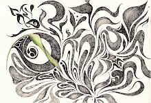
 I am not sure what I am doing with my logo. I am having a hard time achieving the quality that I want. I am using india ink and then I bring it into illustrator. I want a hand drawn quality, but I also want it to be professional and clean. Clean and rugged at the same time.